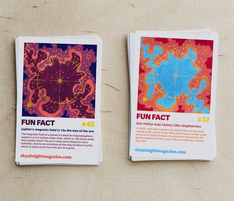
For this project, I created a series of 6 cards containing Space Fun Facts. This was done as a promotional print design, meant to stir up the audience's interest in space.
The layout is inspired by Pantone color cards and polaroid photos, meant as small handouts to engage and delight recipients. This project combines typography, color theory, hand illustration, painting, layout, and branding to create a visually engaging design.

A mockup image of two 'Space Fact' Cards side by side. Each features a large colorful image at the top, and text at the bottom stating a fun fact.

Process:

Patterned Sketch

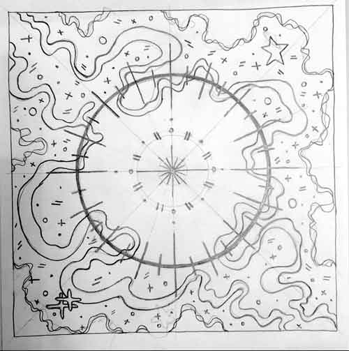
I created an abstract sketch that emphasized pattern, movement, and balance. I intended it to be vaguely space-like, with stars and nebulas, using both organic and geometric shapes.
A photo of a pencil sketch of an abstract celestial spiral.

Paint Application and Color

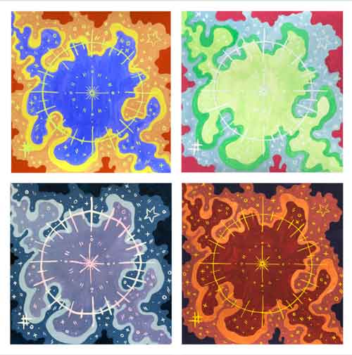
I approached the painting process by doing a carbon copy onto separate 8×8 canvases, and theming each color set around a season (top left to bottom right: summer, spring, winter, wall). I used gouache for its semi-transparency and ability to be reactivated throughout the process.
Four colorful abstract paintings in a 2x2 grid. Each painting has the same pattern, but different colors.

Font Pairings

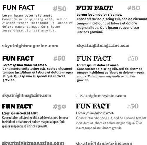
After considering several sets of fonts, I went with a title font that resembled sans-serif Pantone cards. To maintain readability at smaller sizes and to keep a space-like vibe, I went with the smooth Cocon Pro.
A grid of six examples of font combinations, with a title, subtitle, and paragraph section in each.