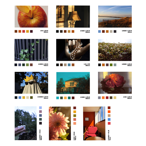
I chose a selection of photos that I have taken, and created a series of photocards. I selected photos that placed emphasis on lighting effects, strong color, and texture, while balancing ISO, Aperture, and Shutter Speed in different contexts. Then, I created a clean and consistent layout format.
Process:
Layout
This layout was created in order to emphasize the colors of each photo, and the simplicity and evenness of the elements offsets the detail of each photo.
Colors
Here are the isolated chosen color schemes from each image.
Fonts
I decided to use Micronica for this assignment, because it has a standard boldness reminiscient of Arial Black, but with a technological curve and geomtrical style that suits the stable layout while maintaining visual interest.