When creating this project, titled ‘safer slicing’, our intention was to create an eye-catching safety reminder for design students who frequently have to use exacto blades to crop printed projects.

An image of a brightly colored poster that reads "Check your placement. Cut the paper, not your fingertips." There is also a digitally illustrated exacto blade cutting across the poster.

Process:

Location

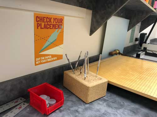
When we were exploring the sign’s potential location, we chose the exacto knife area of the printing room to fit both the relevancy and immediacy of the message.
A cutting counter with two paper slicers, and a block nearby with exacto knives sticking out of it.

Color and Sketches

For this assignment, I wanted to select bright colors with high contrast. The yellow and red I chose for the largest areas are classic ‘warning’ colors. The softer blue helps create contrast and dimension within the color scheme. Within the sketches, I tried out several different ideas for the imagery of the project.
A grid showing three very rough sketches of an exacto blade cutting across a page. Six squares of color, a warm yellow, bright red, soft blue, creamy white, dark brown/purple, and medium teal.

Layout

I wanted to create a visually engaging but still unique layout style. The attention-grabbing text is emphasized through its placement at the top, and the simplicity of the other graphics. 
A grayscale poster that reads "check your placement. Cut the paper, not your fingertips." The font is plain, and the graphics are shapes but not discernible forms.