For this project, I designed a logo for an imaginary ecommerce website that sells potions that have mildly convenient magical effects, such as keeping your shoes tied for the day or making your eyes temporarily a different color.
I wanted the logo to have a fun, fantasy feel, and I was inspired by emblem-style coffee shop logos.
Process:
Font and Color
I selected colors that related to the ‘lucky’ branding of the website, plus some contrasting colors for variety. Green is classically associated with luck, and purple is often associated with magic. I also selected a variety of fonts to try out.
Hand Sketches
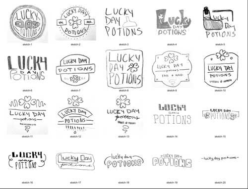
I completed roughly 30 logo sketches and selected 20 of the ones that seemed to be working best.
Logo Varieties
I created 20 digital drafts of different logo concepts, exploring under 9 broader ideas. I was aiming to create an emblem-style logo, but wanted to explore different shape language.